THE 1 ELEMENT CREATING DISTRUST ON YOUR SQUARESPACE WEBSITE + MAKES YOU LOOK SILLY
Visitor time is precious on your website. Its milliseconds. Its a first impression you can’t take back. Its one of the reasons I work so hard to bring wonderful donor-focused experiences to web design for nonprofits. You simply can’t get that time back.
Infact, according to a study done by Missouri University of Science and Technology it takes users less than two-tenths of a second to form a first impression when on a website. And good websites, that are organized and make it easy for them to find what they are looking for, can expect to keep them for about 2.6 seconds. THAT'S IT. That's all the time you have.
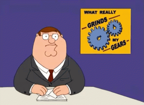
To this point, there is literally only one thing that I see on Squarespace websites, that creates such distrust, makes the owner look silly and frankly… really “grids my gears”. I usually hold my tongue when I meet people and see their websites. I refrain from commenting, suggesting or telling them about broken elements or links. But when it comes to this, I am unashamed and bold… take. it. off.
It's the “Made with Squarespace” tag in your footer.

So what is this element on your Squarepace website?
It's a tag/ link back to Squarespace which in practice and theory is FANTASTIC. It's great promotion for them. We get it and we do this too when we build websites for our nonprofit clients. We place a site credit, or link back for our design work. Ok, so now you are thinking I am a hypocrite. Read on sassy.
The difference is, when you are DIY’ing your website with Squarespace’s awesome tools and builder, there is NO reason to keep it on, keep your platform your little secret. When you hire someone like myself to build out your site and design a custom experience on Squarespace, the site credit should go to them. Leaving it on creates distrust at a base level.
Ok, but why does this element create distrust in your website and make you look silly?
Much like typos, this appears like a glaring oversight to your users. As if you did not take the time to review your website, your type, your content and your links. By leaving it, it makes you look like you cannot be trusted with detail-oriented tasks and perhaps even donations. Guys, this small little thing can easily be costing you donors, funders, volunteers etc.
Think about it; when you see a website with clear spelling errors (dont come for me, its a struggle) or broken links… it makes you question everything they are capable of. The “Make with Squarespace” tag does the same thing. Though it seems innocuous…. I promise its not to the younger generations.
How do you get rid of the element and stop looking silly?
Its super simple and we can dig in now. Watch the videos below on how to do it on either 7.0 or 7.1.
Discover how to remove the MADE WITH SQUARESPACE tag on Squarespace 7.0 websites.
Discover how to remove the MADE WITH SQUARESPACE tag on Squarespace 7.1 websites.