5 Reasons Why CHARITIES Should Be On Squarespace
Ok, yes. I love me some Squarespace. But did you know there are countless LEGIT reasons for a charity to be on Squarespace?
Aside from its awesome customer service + numerous integration possibilities that free up your time… below are my TOP 5 reasons your charity should be on Squarespace.
#1 Updating Content is STUPID Easy
You are juggling too many tasks and wearing too many hats. I have worked for and with enough charities to know that once you say you can do it, it becomes your task until you leave. Am I right!?! So if you have been tasked or volueen-told to maintain the website and you are struggling on the platform that shall not be named (COUGH -wordpress) you might be trying to pass the task off to an intern. BUT before you leave it up to the Gen Z intern there is a better way. Squarespace offers “drag and drop” as well as “email simple” text editing. They have countless global icons that become beacons as you learn the platform. The interface creates a confidence that few other CMS systems encourage. Most importantly, maintaining up to date content on your website is VITAL to gaining donor trust and credibility. You need to be in the site once a month at minimum if not weekly, adding images, flyers, events, blogging (updating news or stories) and keeping visitors informed. I tell my clients all the time; “If you can write an email, you can edit your Squarespace content.”
#2 Creating Event or Campaign Pages in 2 CLICKS
Do you have a lot of initiatives, programs, events or campaigns? Constantly creating more layers to your non-profit to meet grant requirements or metrics? Squarespace makes duplicating a page really easy. Simply hit the COG next to the page you want to duplicate and then scroll down to the bottom where it says “DUPLICATE PAGE”. Thats it! 2 CLICKS! From there you can reformat for your needs, look and event and be on your way. Share it in an eblast (use Squarespace’s Email Campaigns for an even more streamlined process) or put the link on your home page or in your navigation. Done! Now your event or campaign has the digital support and verification that donors and volunteers require in trusting you.
#3 Responsive
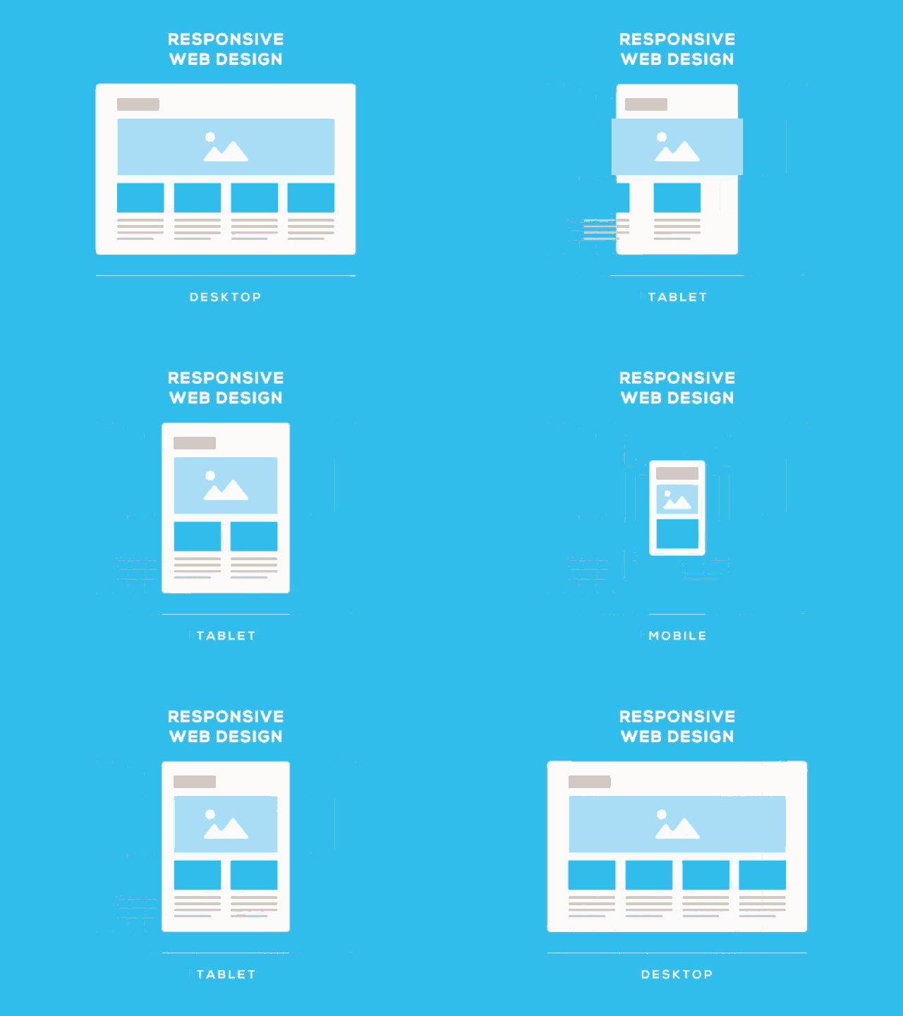
Its no secret that we all bring our phones with us everywhere and we use them often to browse the web and get information. Pay bills and YES! even donate to charities! Currently - about 50% of all web traffic is mobile. So you need to have a mobile beautiful site! Squarespace makes this easy. ALL of their sites are mobile responsive AND all of their elements are beautiful and optimized for desktop, tablet and mobile screens. You can even preview what a mobile user will see right in your dashboard while you are editing and designing.
#4 Donorbox Ready
Much like CMS/ Website platforms… not all donor management systems are created equal. Lately, there has been a rise of the “ALL-IN-ONE” system where you get a website, donor management and everything all in one place. But the problem is, while website needs for a charity will remain relatively the same as it grows and scales up… donor management is not the same for small - large charities. Squarespace can easily handle and scale with any size charity but those all in one donor mangement systems can only take you so far… and then what?! You have to completely recreate your website?! Starting out with a starter donor management program like Donorbox for those Small to Medium sized charities makes the most sense and Squarespace makes this EASY with a simple embed block and the code from Donorbox.
#5 No Updates Needed
My all time favorite reason… no updates are needed from the program and engineering standpoint. Sure, you should update your board, your events and annual reports but plugins, add ons and system updates are not required for you to enjoy Squarespace and let it ride! How great is that! I have had one client who hasnt logged into their website (personal resume) in over 2 years other than to update billing and everything looks wonderful and perfect… that is something that Wordpress could NEVER boast.


